 |
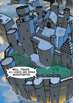
The next, for anyone who was in love with the backgrounds
and buildings of the show as much as any other aspect of it, is the appearance
of Castle Wyvern as the center of page 3. In the show, almost all of the
pull-back views of the castle are from the same angle, and assumed to
be based off one original drawing updated for era, time of day, and ongoing
action onscreen. We have a number of clear shots of the layout, and this
drawing of it appears to be based off a small, blurry thumbnail rather
than a reference material or even a simple
screengrab from the show. The structure and smaller details of the
castle being inexact any fan could forgive; obviously the artists have
a lot to focus on and can't devote too much time to researching and rendering
one single panel of the comic...but the perspective is strangely off-kilter,
giving the castle an Escher-esque feel. |
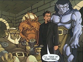
The middle panel of page 4 is probably the single worst penciling job in the
whole book. Nobody is proportioned correctly to their own body type or the others
around them. Xanatos's head looks too big for his body, Goliath looks like a
gorilla and seems to have borrowed Angela's hair; the lower body of both seem
compressed, with the knee joint too high up on the leg. Brooklyn's upper body
seems to have undergone a worse mangling, as if he had been based off his infamous
"no-neck" action figure. No neck, and both chest and upper arms too
thick and squashed; Brooklyn is rangy, and doesn't near Goliath's muscle density
as he is shown as in this image; he looks as though he'd been gulping down the
weight-gain formula body-builders often indulge in. More than that, he is overall
terribly off-model, his expression adding to the suggestion that he is closer
to a gremlin than a gargoyle. He's caping his wings awkwardly, under his arms,
which we've only ever seen him do to let him wear a bomber jacket without ripping
holes in the back of it.
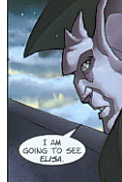
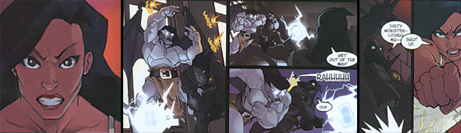
Panel three on Page 14 is the next panel that really jumps out and snaps at
your eyeballs; Goliath with Dumbo-sized ears, sporting an expression that might
have been meant to be glassy-eyed love for Elisa, but the unfocused gaze and
small smile somehow make him look drugged instead. ...............................
next
-->
The coloring is again a nice high contrast...only it is under
his cheekbones and jaw line, suggesting a much sharper edge and sunken skin
than our hero has. Castaway in the next panel and on the next page varies between
well-rendered and goofy looking; the next panel is fine but he looks a little
like he's disco-dancing in it, with the leg placement, whipping jacket, and
upward-stabbing finger. And he is worse than even Brooklyn when it comes to
not looking like himself; mustache aside, he looks a good twenty years older
than he should. Which one could write off to clever use of aging makeup on his
part...save that the shape of his face is just so different than how he appeared
"just a few days ago" during Hunter's Moon.
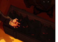 |
Jon Canmore - now John Castaway - continues to be the center
of awkward imagery over the next few pages; aside from his apparently having
boxes of Pacman ghosts to distribute to his newly-dubbed Quarrymen, the
shading on panel four of page 16 doesn't match |
|
the linework, making his hips appear badly twisted from how they should be positioned
in relation to his upper body. It appears that his has just taken a step forward
and his lowered arm stayed behind, sliding off his shoulder like an animation
error.
 |
The big close-up of him at the bottom of 17 is an extremely
powerful image backed up by compelling writing...until you notice that
his left arm appears to have inherited Reed Richard's bendy power and
is snaking around to hold the hammer at a physically impossible angle.
That or he has grown another joint in the middle of his forearm. The position
of the hand wouldn't be so obviously wrong if the shirt and coat sleeve
on that arm wasn't following the same lines.
Page 18, one panel that takes up the whole page, had equal potential
for impact- no pun intended- as he shows how a Quarry-hammer is used by
smashing apart a stone statue of a gargoyle (don't worry, it not a real
garg)... but the coloring again works against the linework. The big speed-blur
is going in the opposite direction it should, looking like Castaway just
demolished the statue with an underhand strike that has now carried up
and over his shoulder...and will likely continue around to take his own
legs out. That suggestion isn't helped by the fact that he actually looks
as though his is starting to fall over backward. I think we all know what
action that this scene meant to imply, and yet the art is suggesting the
opposite.
next
-->
|
Jon's not the only one within that series of pages who isn't
quite looking right; both Elisa and Goliath look like caricatures of themselves
on the first panel of page 16. Goliath as he awakens on page 26 again has the
Pop-eye forearms, this time couple with severely shortened biceps; even the
angle they are thrown out at cannot account for it. And on the last page of
the comic, we are again hit with a couple perspective problems; the angle that
the laser firing at Goliath appears to be should have sliced through Elisa's
chest and arm if it took him across the cheek, and the one through his wing
actually looks as though it is taking off her foot. His back leg again diminishes
too severely, looking almost as though he had pulled it off and left it behind.
Now that we've grumbled our way through the worst bits, what about the rest?
There are good panels in the comic...and then there are also ones that are generic
and mediocre, often due to blasé-looking color work rather than the penciling.
But the first page is pretty nice.
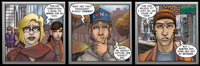
Not blow-your-socks-off amazing, but easily on par or better than many other
comic artwork out there. The shading is realistic and snappy, the changes in
background are nice against the same format of camera-interview and television
studio. The only thing on the page that stands out as wrong is the misspelling
of the second word on the page as "terryifying," which the more generous
will write off to the lady speaking as having an unusual accent.
| Pages 5 through 9 are...almost really enjoyable, except that where the
pencils are good, the coloring doesn't complement it, and when the coloring
is good, the linework- particularly the expressions of the characters- is
weak. Hudson has a consistent greenish tinge, and while Brooklyn looks mostly
like he did in the show, his horns are never done right, whether it is the
angle of their bend, the shape, where they leave his skull, or that they
are just too skinny. It is one of the better series of pages as far as the
coloring having really good contrast, only it is one of the settings where
they would be more muted; moonlight alone wouldn't cause such shiny reflections
on their skin. The last panel of page 5 looks pretty sweet; at least by
comparison, since it is definately the best rendition of Hudson, Goliath,
and Brooklyn so far. ..............................next
--> |
 |
Then Hudson looking virtually identical with his mouth gaping open in panels
two and four of page 6 suddenly makes the comic feel, for all the dramatic coloring
of the page, as though it was a cut-and-paste rush job. It highly distracts
from the pretty and accurate pic of Goliath between them.
 |
If the whole comic was as nicely drawn and colored as Goliath is in that
image and the other close-up of his face at the top of page 10, the fans
wouldn't be complaining near as much. Goliath *looks* like himself - his
face, with an expression we're used to seeing on him now and then. It could
have been cleaned up a little better around the jaw line and ear, but it
is him, through and through. We've missed you, Goliath. Elisa on ten looks
good, too; pretty much on model, nice pencils and expression, and a nice
coloring job.
Page 11 has its weaknesses, but lack of color and contrast is not one
of them; the red sheet covering the statue in the second panel is eye-catching
|
in a good way, and the gargoyle statue, once revealed, is nicely textured,
shaded, and given a realistically frightening-enough expression that we can
see why the crowd there is scared....Even if that fear isn't quite making it
through the way it could if a little more had been going on in the background
of the first and third panel where we see the crowd. Maybe if the blond lady
had raised a hand to cover her mouth, or we had a better view of their bodies
and could have seen a bigger physical reaction.
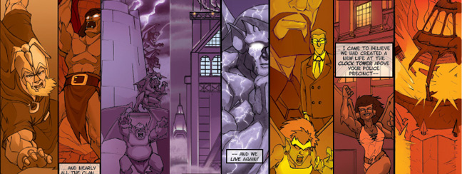
Now we hit 12 and 13. These, like Castaway's appearances in pages 17 and 18,
had the potential to truly make the viewer say "wow!" aloud, and then
doesn't quite have the oomph to pull it off. In this case, it's not distracting
physical or physics problems, it is merely that the shading- assumedly toned
down to make it more obviously a flashbacked-to series of memories- is just
too muted in a couple places. It looks GOOD, these are probably the best pages
in the issue, but it lacks a sparkle throughout the whole set of slices to really
kick.
next
-->
The various color washes are nice, but more variety
of those tones within each slice would have helped. But the wash of memories
does pour over anyone familiar with the show the same way it is pouring over
Goliath; Hakon, Macbeth, Demona, and Owen all present, all obvious from appearance
and context who they are; and if Fox's face doesn't seem to have quite her usual
cover-model beauty, she's still easily recognizable as well.
There are a few nits to pick, like Goliath's huge wrists in the first slice,
Xanatos's uneven and bloodshot eyes in the eighth, and Angie's downright goofy
expression in the ninth one. I think making the three center pieces all indigo-toned
was a mistake, making them sink together between the yellows and oranges of
the slices to either side. But Goliath just starting to awaken in the seventh
slice...if anything more had been done with the sky behind him, it would have
been a truly grin-worthy image.
 |
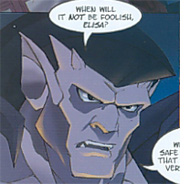
The top panel of the next page 14, is equally as good, although the angle
and size of Goliath's face is strikingly similar to page ten. It is better-colored
than the latter, with his eyes looking more realistic (and brooding). Elisa
again looks good, |
no complaint can be made about the graphic of her there, either. Page 19 is the
clocktower and the building it caps, and it is nicely done, if not the most dramatic
or energetic page in the comic. The perspective is all equal, although it is a
little confusing before you realize the top bar of images on that page are Goliath
on Elisa's balcony, and not him randomly standing sideways in front of the precinct.
And the fourth panel of page 20, focusing on captain Maria Chavez, is another
prime example of the artist's talent. Why it seems to be absent from so much of
the rest of the comic is open to debate, and certainly has been debated to death.
The fourth panel of 21 is well-drawn, although it could
also have used a little bit more depth in the shadows and shading in regards
to the "sun is almost done" time of day. Elisa's apartment looks
right, and she looks pretty cute standing there in the oversized jersey
she was using as a nightgown.
The first panel of page 23 is another good one, with the linework and
shading going hand-in-hand to produce some well-rendered musculature on
Elisa and a properly soft look for her hair and dress. Unfortunately,
this is another one that one can't enjoy thoroughly due to the character
not quite looking as she should- but this time it isn't her face so much
as about a foot below it. Elisa either is wearing the world's best miracle
bra, or she was visited by the Boob Fairy while she was asleep a couple
pages back, 'cause those curves aren't canon. Nice dress, though. .............................................................next
--> |
|
.
While the coloring again sadly lacks for variance in some panels, and came
across in other places as too dark, the whole sequence of the fight and chase
scenes that covers pages 22 to 30 finally picks up and moves, and takes the
reader with it. The dialogue is also a bit punchier than the television version,
too; a nice reminder that we can expect scripts with more colorful language
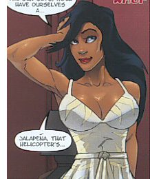
than "phooey." It was also fun to see a return of the use of Jalapena!
in the comic; everyone loves a good in-joke.
The problem here, and throughout the comic overall, isn't so much that the
art is bad, but that it just isn't quite good enough for ten years worth of
waiting. And while a great story and good writing can make up for mediocre art,
for any who have heard this story before, there isn't any suspense to the plot
to keep us jumping on the words alone. We find ourselves drawn to the graphics
alone, comparing the art to the show, to the art produced in other comics and
by those members of the fandom who are so highly-talented that they already
have careers in the art world. But there are definately places in the comic
that show that these artists are trying, are improving, and are capable of making
a comic that we all would thoroughly enjoy looking at. Whether or not they do
so in issue #2 remains to be seen, it is a pretty wide gap to close with even
less time to work on it than they had for the first one. At least we can hope
they stop drawing Elisa looking like she's of Asian descent.
How much of the art issues hinged on a reported problem that altered the quality
of color in the comic throughout the whole print run is unclear; but certainly
there is a noticeable difference between the colors of the printed cover of
issue #1, and its original
appearance.
~